
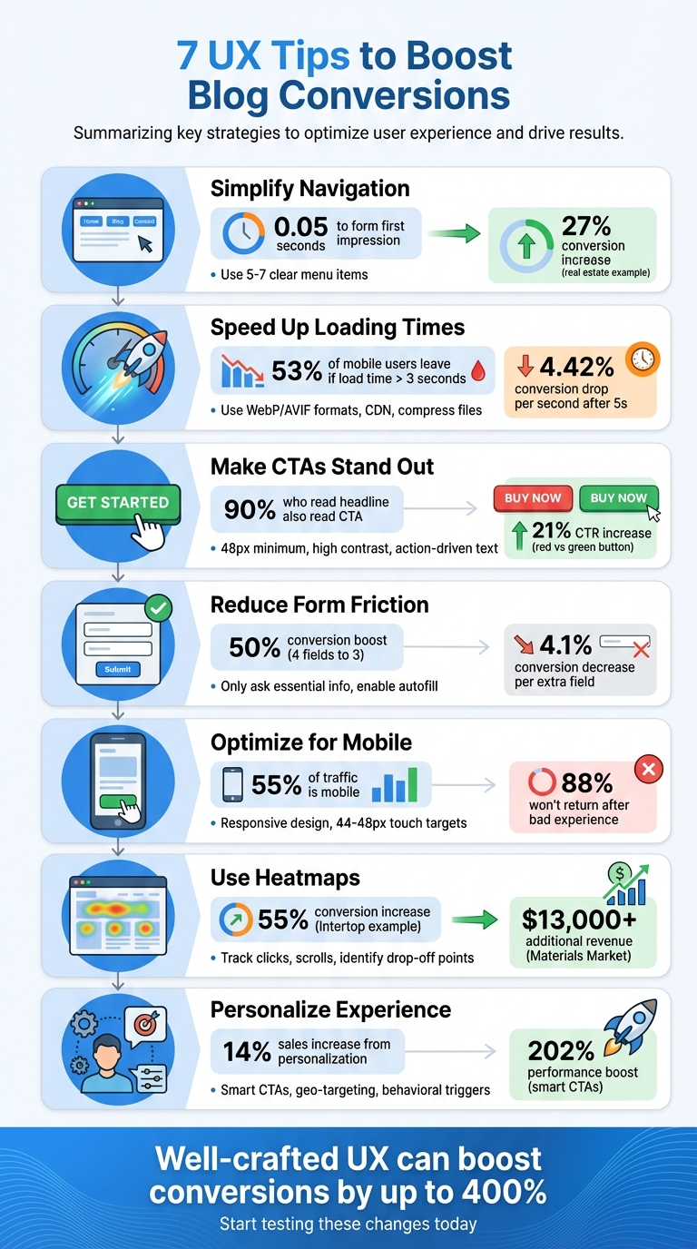
Your blog’s design directly impacts how well it converts visitors into subscribers, buyers, or leads. Poor user experience (UX) – like slow loading times, unclear navigation, or weak calls-to-action (CTAs) – can silently lower your results. But small adjustments can make a big difference. Here’s how you can improve UX to increase conversions:
- Simplify Navigation: Use 5–7 clear menu items and position key links where users naturally look.
- Speed Up Loading Times: Compress images, minimize JavaScript, and use a Content Delivery Network (CDN).
- Improve CTAs: Use clear, action-driven text and high-contrast designs to make them stand out.
- Streamline Forms and Links: Reduce form fields, enable autofill, and fix broken links.
- Optimize for Mobile: Use responsive design, larger touch targets, and test on real devices.
- Use Heatmaps: Analyze user behavior to adjust content layout and reduce "scroll cliffs."
- Personalize Experiences: Tailor CTAs, content, and messaging based on user behavior or location.
Key takeaway: Even small UX tweaks – like faster pages or clearer CTAs – can lead to big conversion gains. Start testing these changes to see what works best for your audience.
7 UX Tips to Boost Blog Conversions – Quick Reference Guide
11 UX design tips to lift conversion rates
sbb-itb-112c64b
1. Create Simple, Clear Navigation Menus
Your navigation menu is often the first thing visitors notice, and it shapes their impression in just 0.05 seconds. A cluttered or confusing menu can send them away almost instantly.
To avoid overwhelming your audience, stick to 5–7 top-level menu items. Think of your navigation as a roadmap that guides readers to important destinations. This way, you create a seamless experience that feels intuitive.
"If a user has to ‘think’ about where to click, you’ve already lost them. I believe in keeping navigation stupidly simple – no vague labels, no fancy words." – Mukul Singh, Founder, Digital4design
Be specific with your menu labels. Replace generic terms like "Resources" or "News" with something clearer, such as "Beginner SEO Tips" or "Affiliate Marketing Guides." For instance, in 2026, Aaron Franklin, Head of Growth at Ylopo, worked with a Scottsdale real estate team to move a "School Districts" link from a buried submenu to the main menu. They renamed it "Top-Rated Schools Near You", which led to a 27% increase in conversions over six weeks.
Placement matters too. Position your most critical pages – like "Services", "Contact", or your main call-to-action – at the far left or right of the menu. These spots naturally draw more attention. Also, ensure that your blog uses the same header navigation as your main site, so visitors can easily find your key offerings wherever they land.
2. Speed Up Your Page Load Times
Once visitors land on your site, keeping them engaged depends heavily on how quickly your pages load. Slow load times can seriously hurt your conversions. Here’s a staggering stat: 53% of mobile users leave a site if it takes more than 3 seconds to load. And the longer the delay, the worse it gets – conversion rates drop by an average of 4.42% for every extra second after the 5-second mark. Even a tiny 100ms delay can shave off 1% of sales, as Amazon has discovered.
Images are often the biggest culprits when it comes to slowing down pages. Switching to WebP or AVIF formats can cut file sizes by 30–50%. For example, a SaaS team reduced their homepage load time from 4.8 seconds to 2.1 seconds by using WebP and enabling lazy loading, which led to a 25% increase in organic traffic.
JavaScript can also bog down your site. Minify your scripts and use defer or async attributes to stop them from blocking the rendering of your pages. Additionally, third-party scripts – like chat widgets or tracking pixels – are often unoptimized and can drag down performance.
"Every third-party script you add is like inviting a stranger to a dinner party. You don’t know how much they’ll eat or how slow they’ll walk. Audit them or serve them locally." – Itamar Haim, SEO Team Lead, Elementor
Another game-changer is using a Content Delivery Network (CDN), such as Cloudflare, to serve your content from servers nearest to your visitors. This reduces latency and speeds up delivery. Pair this with Brotli compression to shrink HTML, CSS, and JavaScript files before they reach users. These technical tweaks can make a huge difference – sites that load in under 5 seconds consistently achieve the best conversion rates. And when combined with other user experience upgrades, faster load times can significantly boost your bottom line.
3. Make Your CTAs Stand Out
Once you’ve optimized navigation and load times, your Call-to-Action (CTA) buttons become the next big deal for turning visitors into customers.
CTA buttons might be small, but they pack a punch when it comes to conversions. A few thoughtful tweaks can make a big difference.
Design for attention. Make sure your CTA buttons are at least 48px wide for mobile users, and use high-contrast colors to grab attention – studies show this speeds up recognition by 83%. For example, in one A/B test, a red button outperformed a green one by 21% in click-through rates. Just be sure the color meets the WCAG AA contrast ratio of 4.5:1 to ensure accessibility for all users.
Placement is everything. Did you know over 90% of people who read your headline will also read your CTA? That’s why placement is key. For simple offers, keep your CTA above the fold – buttons in the top third of a page get 73% more visibility. On the other hand, for more detailed content, placing the CTA at the end can work better. Content Verve saw a whopping 304% increase in conversions by moving their primary CTA to the bottom of a long-form landing page, where readers had time to digest the full pitch.
Be clear and action-driven. Forget vague phrases like "Click Here." Instead, use specific, action-oriented language. For example, changing "Scheduled Posts" to "Schedule TikTok Posts Now" helped boost conversions from 10% to 25%. Even small tweaks like using first-person language – think "Get My Report" instead of "Get Your Report" – can improve results by 7–15%. Keep it short and sweet; 3–4 words often do the trick.
"The CTA is the smallest element on most pages and the most important one." – Boundev Team
Style for impact. Surround your CTA with plenty of white space and use design elements like rounded corners, subtle shadows, or eye-catching backgrounds to make it stand out. Adding quick reassurance, like "No credit card required", in small text nearby can also help reduce hesitation.
Small design and copy changes can transform your CTAs into powerful tools for conversion.
4. Reduce Friction in Forms and Links
Once you’ve fine-tuned your CTAs, the next step is to ensure your forms and links are as user-friendly as possible. Streamlining forms can make a huge difference in your conversion rates. For instance, dropping the number of form fields from four to three can boost conversions by nearly 50%. On the flip side, every additional field you add decreases the conversion rate by about 4.1%.
So, what’s the key? Only ask for the information you absolutely need. For a newsletter signup, stick to just an email address – or maybe a name if it’s essential. For webinar registrations, keep it simple: name, email, and company. Adding extra fields, like a phone number, can lower conversions by up to 5%. Why? Because every unnecessary question makes users more likely to abandon the form.
"Every extra field you add is another reason for someone to bounce." – Brad Holmes
To make things even easier, enable browser autofill and real-time validation. Features like green checkmarks for correct entries or red highlights for errors can speed up form completion by 35% and reduce abandonment rates by as much as 75%. If your form spans multiple steps, consider adding a progress bar – it can cut abandonment by 35%.
Once your forms are optimized, shift your attention to your links. Broken or poorly functioning links can frustrate users and damage your credibility. Regularly test every link and button on your site to ensure they work as intended. When creating anchor text, be descriptive. Instead of vague phrases like "click here", use text that clearly tells users where they’ll land.
For mobile users, make sure all tap targets are at least 44 x 44 pixels. This helps prevent accidental clicks and keeps navigation smooth. Conducting regular link audits is an excellent way to maintain a seamless user experience and keep visitors engaged.
5. Make Your Blog Mobile-Friendly
With mobile devices driving over 55% of all website traffic, optimizing your blog for mobile users is no longer optional – it’s essential. Google’s mobile-first indexing means the search engine primarily evaluates the mobile version of your site when determining rankings. If your blog doesn’t deliver a smooth mobile experience, you risk not only frustrating your readers but also damaging your search visibility.
Consider this: 88% of online users won’t return after a single bad experience. And the stakes are high – Walmart found that shaving just one second off page load time boosted conversions by 2%, while ESPN’s mobile redesign increased revenue by 35%. These numbers highlight the direct link between mobile usability and business outcomes.
Start by implementing responsive design so your blog automatically adapts to different screen sizes [45,48]. This ensures text, images, and layouts look great on any device. To minimize user frustration, make sure touch targets are at least 44–48 CSS pixels wide with 8–12 pixels of spacing. This prevents accidental clicks caused by buttons or links being too small or too close together [46,47]. Place your key navigation elements and calls to action within easy thumb reach – typically in the lower or middle sections of the screen.
For readability, use a 16-pixel font size at minimum and keep line lengths between 30–40 characters [46,51]. Short paragraphs and large, tappable buttons make content easier to interact with, while a collapsible "hamburger" menu can help maintain a clean, uncluttered layout [46,47].
Testing is crucial. Tools like Lighthouse (available in Chrome DevTools) and PageSpeed Insights can uncover issues like slow loading times or poorly spaced touch elements [48,51]. But don’t stop there – test your blog on actual devices to see how it performs in real-world conditions. A fast, user-friendly mobile experience is key to keeping visitors engaged and boosting conversions.
6. Use Heatmaps to Improve Content Layout
Heatmaps offer a visual way to understand how users interact with your page. By tracking clicks, scrolls, and dwell times, they provide a color-coded map: red and orange indicate areas of high activity, while blue and green show less engagement. Instead of relying on guesswork, heatmaps give you direct insight into what grabs your audience’s attention.
To start, you’ll need to add a JavaScript tracking snippet to gather user data. Different types of heatmaps can reveal specific behaviors:
- Click maps: Show where users are clicking or tapping.
- Scroll maps: Indicate how far down the page visitors scroll before leaving.
- Rage click maps: Highlight spots where users repeatedly click on elements that don’t respond.
These insights can lead to actionable changes. For example, Materials Market used scroll maps to reposition their main call-to-action (CTA), resulting in a 1.1% boost in conversions and over $13,000 in additional annual revenue. Similarly, Intertop improved the clarity of its product filters using click maps, which increased conversions by 55%.
One key area to focus on is the "scroll cliff" – the point where most users stop scrolling. If your scroll map shows a sharp drop-off at 25% of the page, consider moving your most important content and CTAs above this point to keep users engaged. Another useful insight is identifying dead clicks – areas where users click on non-interactive elements. Converting these into clickable features can enhance the user experience.
Free tools like Microsoft Clarity make it easy to get started, as they have no traffic limits.
"Heatmaps allow you to optimize layouts, enhance user experience (UX), and boost conversions based on real behavior, rather than guesswork." – Nahid Komol, Digital Marketing Strategist
7. Customize the User Experience
Improving navigation and simplifying forms are great starting points, but taking it a step further with personalization can truly elevate your blog’s impact. By tailoring the experience to fit each visitor’s needs and behavior, you can make your content feel more relevant – and that relevance pays off. Personalized content can drive a 14% increase in sales, making your blog more engaging for every reader.
One simple yet effective way to start is by using smart CTAs (calls-to-action). For example, first-time visitors might see a CTA like "Download Free Guide", while returning users are shown "Book a Demo." This small adjustment can boost performance by as much as 202% compared to generic CTAs. Orascom Hotels Management took things further by swapping their generic homepage for personalized banners reflecting visitors’ previous searches. The result? A 60.75% jump in booking conversions, generating $352,377 in revenue from just one campaign.
Geography-based personalization is another powerful tool, and it doesn’t even require prior user data. One Click Ventures, for instance, tailored their on-site messaging and checkout process to suit visitor locations, resulting in a 30% increase in conversions. For bloggers, this could mean showing region-specific related posts or tweaking your language to match local preferences.
"From a CRO perspective, content personalization isn’t about adding complexity; it’s about removing uncertainty and reducing decision friction." – Pratyusha Guha, Manager – Content Marketing, VWO
If you’re using WordPress, tools like If-So Dynamic Content can help you create location-based rules, while OptinMonster allows for behavioral triggers like exit intent. Even small tweaks, such as using first-person language in CTAs (e.g., "Get my free quote" instead of "Get a free quote"), can make a difference, increasing conversion rates by 17%–24%. These personalization strategies, when combined with earlier UX improvements, can make your blog a conversion powerhouse.
Conclusion
Improving your website’s user experience doesn’t require a complete overhaul – just a few targeted adjustments to eliminate friction and encourage action. The seven strategies we’ve discussed – like simplifying navigation, improving load times, personalizing CTAs, and optimizing for mobile – work together to create a more seamless journey from visitor to conversion. In fact, a well-crafted user experience can boost website conversion rates by up to 400%.
These practical changes offer a solid foundation for measurable results. Start by testing improvements right away. Set baseline metrics, roll out changes gradually, and use tools like A/B testing and heatmaps to track how users interact with your site. Keep in mind, every audience is different – what resonates with one group may not work for another. Experiment and fine-tune your approach.
UX optimization isn’t something you do once and forget about – it’s an ongoing effort to understand your audience and adapt to their changing needs. As Scott Johnsen, Head of Design at Alto, explains:
"UX is a process of deeply understanding the user’s needs and objectives, identifying where their greatest problems exist, and working generatively to ideate ways to solve these problems".
Consistent, small improvements over time can lead to big wins in both revenue and user satisfaction.
Armed with these strategies, your blog is ready to achieve impressive conversion growth. For more detailed advice, check out Blogger Outline for expert tips on content creation, SEO, audience engagement, and monetization. By embracing these changes, you’ll not only boost conversions but also enhance the experience for every visitor.
FAQs
Which UX change should I test first for faster conversions?
Start by tweaking your CTA text to match what your audience is looking for. This small change can make a big difference in boosting clicks and conversions by ensuring your calls-to-action feel more relevant and appealing to your users.
What’s a good page-load time goal for a blog?
Aiming for a page-load time of under three seconds is a solid goal for a blog. In fact, Google suggests targeting less than three seconds, with an ideal benchmark of just half a second. Why? Because faster load times not only boost user experience but also help with SEO. A speedy site keeps visitors engaged and improves overall performance.
How can I personalize CTAs without collecting personal data?
Personalizing CTAs can be done effectively without tapping into personal data by focusing on contextual and behavioral cues. For example, you can tweak the text, colors, or placement of a CTA based on user actions – like revisiting a particular page or interacting with specific content.
Another approach is using dynamic CTAs that adjust to factors such as the user’s location, device type, or even the time of day. These methods not only make the CTA more relevant but also respect user privacy, striking a balance between personalization and data protection.