
A/B testing is a method to compare two versions of content to see which performs better using real user data. It helps bloggers move from guessing to making decisions backed by data. Simple changes, like tweaking headlines or redesigning pop-ups, can lead to big improvements in metrics like click-through rates (CTR), conversions, and engagement.
Key takeaways:
- Small changes can lead to big results: For example, a fullscreen pop-up boosted conversions by 79%, and adding testimonials increased sign-ups by 138%.
- Focus on high-impact areas: Test elements like headlines, CTAs, or layouts that directly affect user behavior.
- Use tools like heatmaps and analytics: Identify where users lose interest and target those areas for testing.
- Run fewer, smarter tests: Only 12% of A/B tests succeed, so prioritize meaningful changes over minor tweaks.
Start by testing one key element, track results, and iterate for continuous improvement. Even small adjustments can lead to measurable gains over time.
How to Do A/B Testing: 15 Steps for the Perfect Split Test
3 A/B Testing Case Studies from Successful Bloggers
These case studies highlight how bloggers tackled engagement challenges using A/B testing. You’ll see the exact strategies they implemented, the metrics they monitored, and the results they achieved. These examples offer practical insights for applying targeted A/B tests to boost your blog’s performance.
Case Study 1: Testing Pop-Up Designs to Increase Conversions
Crossrope, a fitness-focused e-commerce brand, aimed to capture more email subscribers from visitors who were about to leave their blog. At the time, their existing exit-intent pop-up had a conversion rate of 7.65%. They wondered if a different design could yield better results.
They decided to test a fullscreen exit-intent pop-up against their original design. The fullscreen version eliminated distractions and made the email signup offer impossible to ignore. The result? Conversions jumped to 13.71% – nearly doubling their original rate.
This experiment showed that bold design choices can outperform subtle ones, especially when trying to grab the attention of visitors on the verge of leaving your site.
Case Study 2: Improving Newsletter Open Rates with Subject Line Tests
Nicole Lee, content lead at The Remote Company, faced a challenge familiar to many: getting subscribers to open newsletters. To tackle this, she used MailerLite’s A/B testing feature to experiment with different subject lines for each campaign.
For every newsletter, she tested two subject lines with a small segment of her audience. The version with the higher open rate was then sent to the rest of her subscribers, consistently improving overall open rates by 10% on average.
The secret wasn’t about discovering a “perfect” subject line – it was about creating a systematic testing process. This method allowed her to fine-tune her approach over time, proving that consistent testing leads to better engagement.
Case Study 3: Adding Customer Testimonials to Landing Pages
Bjork from Food Blogger Pro wanted to boost signups for his blogging education platform. His homepage at the time converted at a low rate of 0.38%, meaning only about 4 out of every 1,000 visitors were signing up.
Using Google Experiments, he revamped the page with several changes: a video background, a streamlined layout focusing on the signup, and testimonials placed prominently near the call-to-action (CTA). These adjustments increased the conversion rate to 0.90%, a 138% improvement.
Bjork focused on what he called the “think and hover” moment – the brief hesitation before a visitor clicks the signup button. By placing testimonials right at this critical moment, he addressed potential doubts effectively. As he explained: “A clear call to action is good, but a clear call to action along with a testimonial is great”.
To further ease concerns, he added a “Common Questions” section near the billing area, tackling objections like “Can I cancel anytime?” before users even had to ask. This demonstrated how addressing hesitation with timely testimonials and helpful information can significantly improve conversions.
Performance Metrics Comparison
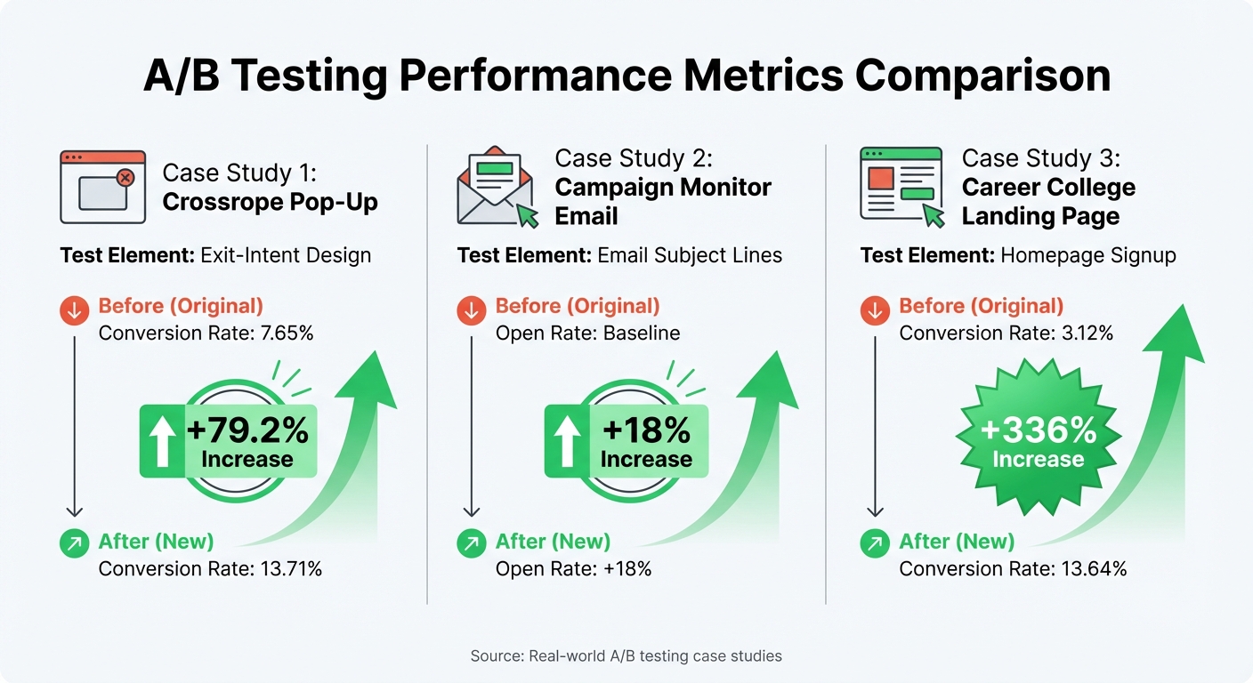
A/B Testing Results: Conversion Rate Improvements from 3 Real Case Studies
Using real-world examples, these performance metrics showcase how A/B testing can lead to measurable improvements across various strategies.
Side-by-side comparisons reveal that well-targeted A/B tests can significantly enhance blog engagement and other key performance indicators. Each test focused on refining a specific element, tackling unique challenges, and delivering quantifiable results.
For instance, Crossrope implemented a fullscreen exit-intent pop-up that boosted conversion rates from 7.65% to 13.71%. Similarly, Campaign Monitor tested email subject lines, resulting in an 18% increase in open rates. Another example comes from Dustin Sparks, who redesigned a career college landing page by repositioning social proof and minimizing distractions. This led to a staggering conversion rate jump from 3.12% to 13.64%, representing a 336% improvement.
These cases demonstrate that even small adjustments – like tweaking design elements or rewriting copy – can yield substantial engagement gains, sometimes doubling or tripling key metrics.
Results Table
The table below provides a clear summary of the key metrics and improvements achieved through these tests:
| Case Study | Metric Tested | Original Value | Variant Value | Improvement Percentage |
|---|---|---|---|---|
| Crossrope Pop-Up | Exit-intent pop-up conversion rate | 7.65% | 13.71% | 79.2% |
| Campaign Monitor Email Test | Email open rate | Baseline | Baseline +18% | 18% |
| Career College Landing Page | Homepage signup conversion rate | 3.12% | 13.64% | 336% |
These results highlight the potential of A/B testing to address specific friction points – whether it’s optimizing pop-ups, refining email subject lines, or redesigning landing pages. The outcomes range from modest gains to transformative improvements, all backed by measurable data.
sbb-itb-112c64b
How to Apply These A/B Testing Strategies to Your Blog
Finding the Best Elements to Test
Start by pinpointing where your readers seem to struggle or lose interest. Tools like heatmaps and session recordings can help you see exactly where users are clicking, how far they scroll, and what they tend to ignore. For example, Wallmonkeys used Crazy Egg’s heatmaps and discovered that visitors were skipping over the "Shop Now" button. By simply repositioning their search bar, they achieved a staggering 550% increase in conversions.
Google Analytics is another great resource for identifying high-traffic pages that have high bounce rates. These pages are prime candidates for testing. Consider trying out changes like adding related post links, engaging images, or even videos to encourage readers to stay longer.
Don’t overlook the elements that directly influence reader actions. For instance, headlines are critical for driving traffic. Before committing to a headline, test variations on social media platforms to see which resonates most. Similarly, experiment with your call-to-action (CTA) wording. A great example is Going (formerly Scott’s Cheap Flights), which changed their homepage CTA from "Sign up for free" to "Trial for free" in 2024. This small tweak resulted in a 104% increase in trial starts within a single month.
Choosing Tests That Will Improve Engagement Most
Once you’ve identified key elements, focus on tests that are likely to deliver noticeable improvements in engagement. Keep in mind that only 12% of A/B tests tend to succeed in achieving their primary goal, so prioritize changes that address real pain points instead of minor, cosmetic adjustments.
One area worth testing is social proof placement. WorkZone, for instance, changed their customer testimonial logos from color to black and white to draw more attention to their lead generation form. This subtle change led to a 34% increase in form submissions after just 22 days of testing. When using testimonials, opt for ones that highlight measurable results (like "reduced costs by 40%") rather than just listing company names or logos.
Your CTA copy is another critical factor. Replace vague phrases like "Learn More" with action-specific language such as "Get the Full Guide" or "Start My Free Trial." Bettingexpert.com tested this approach by changing their sign-up form header from "Join BettingExpert" to "Get FREE Betting Tips." Over 9 days and 13,560 visitors, this adjustment boosted sign-ups by 31.54%. The takeaway? Your CTA should clearly answer the question, "What’s in it for me?"
Lastly, don’t underestimate the power of visual content. Tweets with expanded images, for instance, saw 18% more clicks, 89% more favorites, and 150% more retweets compared to text-only tweets. For blog posts, try testing lifestyle images that show your product or concept in a relatable, real-world setting. Readers are more likely to engage when they can picture themselves in the scenario.
Conclusion
The case studies we’ve explored highlight a key takeaway: A/B testing isn’t reserved for big corporations with deep pockets. It’s an accessible and effective method for bloggers of all sizes to boost engagement and conversions. From tweaking the placement of a search bar to refining the wording of a call-to-action (CTA), even small adjustments can lead to measurable results.
Begin with data, not guesses. Tools like heatmaps and analytics can reveal where readers encounter obstacles or lose interest. Focus your testing efforts on these critical areas. Keep in mind that only 12% of A/B tests typically yield positive outcomes. So, instead of making random changes, zero in on elements that directly influence user behavior – your headlines, CTAs, form fields, or overall content layout.
"You don’t need to run 200 tests a year. You need to run 10 good ones. Run fewer, bolder tests that address real issues."
– Anubhav Verma, Associate Content Marketing Manager, Optimizely
Start small and build momentum. Choose a high-traffic element, test a variation designed to resolve a specific friction point, and once you’ve identified a winner, use it as your new baseline. Then, continue iterating to achieve cumulative improvements. This method reflects the blog’s overarching philosophy: consistent, data-driven progress.
The bloggers featured here didn’t achieve their results overnight. Their success came from deliberate testing and a willingness to challenge assumptions. Your blog can follow the same path. Pick one key element to test today and incorporate these strategies into your routine. By doing so, you’ll steadily refine your approach and elevate engagement over time.
FAQs
What should I test first to improve engagement on my blog?
To figure out what to A/B test first, zero in on elements that directly influence your engagement goals – whether that’s boosting time on page, click-through rates, or conversions. Dive into your site analytics to pinpoint high-traffic pages with low engagement. These pages often hold the greatest potential for improvement.
Start with straightforward, impactful tweaks. Think blog post titles, featured images, call-to-action (CTA) text, or even font styles. For instance, testing a headline that highlights clear benefits or switching to a more eye-catching image can quickly show what grabs your audience’s attention. Just remember: test one element at a time to keep your results accurate, and give your experiment enough time to collect meaningful data.
By taking a targeted, data-backed approach, you can steadily boost your blog’s performance and create a clear path for future optimizations.
What are the best tools to analyze user behavior for effective A/B testing?
To get the most out of your A/B testing, it’s smart to use tools that combine user behavior insights with testing capabilities. Optimizely, for instance, provides a robust platform that tracks metrics like clicks, scroll depth, and conversion funnels. This helps pinpoint which changes improve engagement metrics such as time on page or click-through rates.
Another great option is VWO, which offers features like heatmaps, session recordings, and surveys. These tools give you a clearer picture of where your audience is engaging and where they might be losing interest.
For a more visual breakdown, Crazy Egg stands out with its heatmaps and click-tracking dashboards. These tools make it easier to see how readers interact with your blog posts, helping you create well-informed hypotheses based on actual user behavior. If you’re focused on landing pages or email templates, Unbounce is a user-friendly choice. It comes with a simple editor and real-time performance tracking, making it perfect for quick tests.
If you’re looking for a more guided approach, Blogger Outline combines trusted tools with expert advice. It helps you set up experiments, analyze user data, and refine strategies to improve blog engagement. By using the right tools and insights, you can transform user behavior data into practical strategies that enhance your blog’s performance.
Why do many A/B tests fail, and how can I increase my chances of success?
Many A/B tests fall short because they miss the mark on what to test, lean on assumptions instead of solid data, or lack a clear direction. Common pitfalls include experimenting with small tweaks that barely move the needle, failing to identify a key metric to track, or not having enough traffic to produce statistically reliable results.
To set yourself up for better outcomes, begin with hypotheses grounded in data and prioritize testing changes that have the potential for a big impact on your goals. Clearly define a primary metric to gauge success, ensure your sample size is sufficient for dependable insights, and resist the urge to dilute your focus by running too many low-priority tests. By approaching A/B testing with a strategic mindset, you can turn it into a powerful tool for driving real improvements.